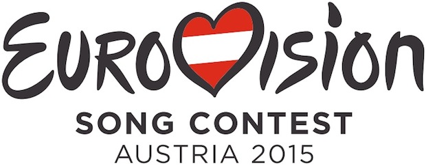
EBU has decided to bother webmasters of eurovision sites this summer !…
The generic logo as we know it since Istanbul back in 2004, is gonna be replaced by a updated version, more sober in its typography.

Of course, the most symbolic development is on the heart.
The small interlacing in the center is gone (considered too grungy for 2015) and to boost it, the country’s flag is no longer straight – don’t forget this is eurovision…
An other significant development is the right ventricle, now predominant.
The remaining question : which city will have wear this logo for the very first time ?… Just a few days more to wait… ORF has already announced dates – grand finale May 23 – but extends the waiting for the venue.
This post is also available in accédez ici à la version française.
 eurovision69 – eurovision song contest 2017